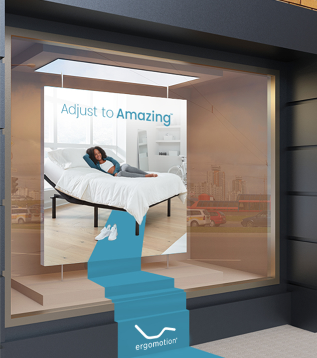
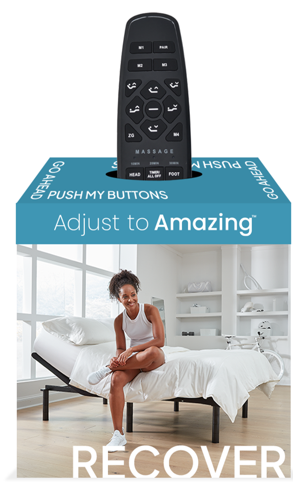
Consistency meets Innovation: Developing a Branded Visual System for Ergomotion
Branding and Campaign Development
I led the development of an overarching branding and visual system for Ergomotion’s adjustable bases. Working alongside the talented team at Visualeyes Creative Agency, I art directed the photoshoot, guided the design, and collaborated on the creation of a national campaign—including a website redesign, digital and print assets, and a point-of-purchase (POP) package designed to educate and attract consumers in retail stores across the country.
Centered around the tagline “Adjust to Amazing,” the logo and color system were intentionally built upon Ergomotion’s existing brand to maintain consistency and unity across individual product lines.
The concept behind this visual system was driven by the need to keep the focus on the product itself—rather than ancillary lifestyle elements typically featured in the category. By creating an all-white palette and set, the product stood out visually and allowed supporting messaging and graphics to clearly brand it as part of the Ergomotion identity.