Logo Design
In-House Brief: Create a logo mark for the newly named Keeson Technology Corporation Limited, the manufacturers of various sleep products in China.
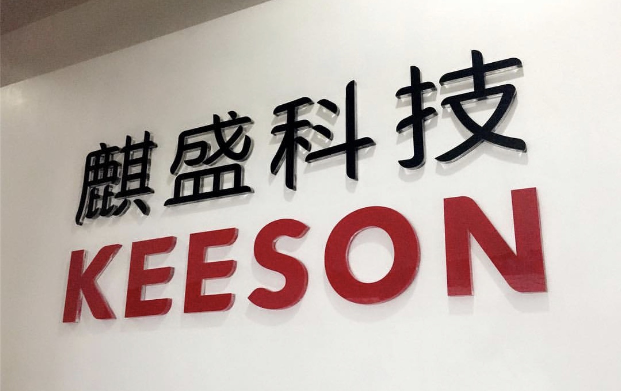
I created a variety of options for the company, exploring both text and illustrations that aligned with Chinese culture and design preferences. Ultimately a custom type treatment suited the company’s corporate structure and public presence the best. The Pantone red color is viewed as strength and prosperity, and was the best representation for the logo. After presented with various options created from the creative team, leadership agreed on the mark, and the Chinese team decided on their preference for the Mandarin translation.
The logo is now used universally on all corporate materials, and factory/office signage and collateral. The image below is taken from the entrance of the corporate office.